
In this article, we pinpoint the not-so-obvious functions available in Power BI. We focus on visualization and smart features that our Business Intelligence team finds very useful.
ERROR BARS
When working with data and displaying specific value points on your charts, it is often necessary to estimate the range of other possible values around that point. This is where error bars come in handy. They allow you to show the upper and lower bounds of the values on your line chart.
How to use Error Bars?
Create your line chart, clustered bar chart or combined – the Error Bars are available for these chart types. Next, define the upper and lower limits for your value points;, you can use both measures and static values. After that set the appropriate values as error bars – yYou’ll do this in a new bar available in the Analytics pane, as shown below:
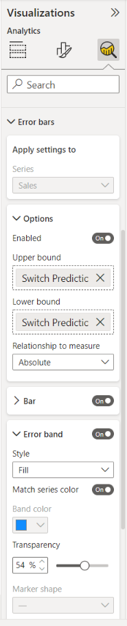
Now, select the measure to which you want to add error bars. In the pane, you’ll see several options to customize the bars. The error bars are customizable according to how you would like them to appear on the chart.
Below, we present them as shaded areas:
- A vertical line with horizontal caps on either end (by default)
- Shaded areas
- Markers
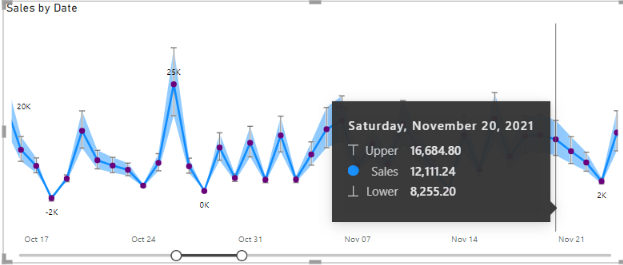
When you hover over a point, you’ll also see the range of uncertainty values in a tooltip.
MOVING SHEETS WITHIN A REPORT
Here’s a helpful hint on how to move sheets within a report, which can be very useful if you have many pages.
If you need to move a page to the front or elsewhere, follow these steps:
1. Click the sheet you want to move.
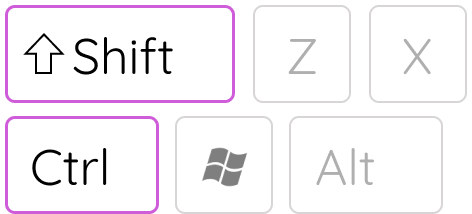
2. Press the Shift+Ctrl key combination
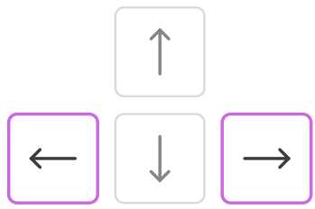
3. Use the arrow keys to shift your chosen sheet elsewhere.
PERIOD SLICER
A period slicer is a type of filter that simplifies selecting specific, frequently used time filters in a report. Slicers are present on the report next to a graph or chart as visuals, making them easily accessible for selecting specific date ranges.
Advantages of Period Slicers:
- They are visible and easily accessible.
- They show which filters have been applied without needing to check a drop-down list.
- You can use a slicer to include additional data and keep it hidden, so it doesn’t disrupt the general picture.
How to create a period slicer?
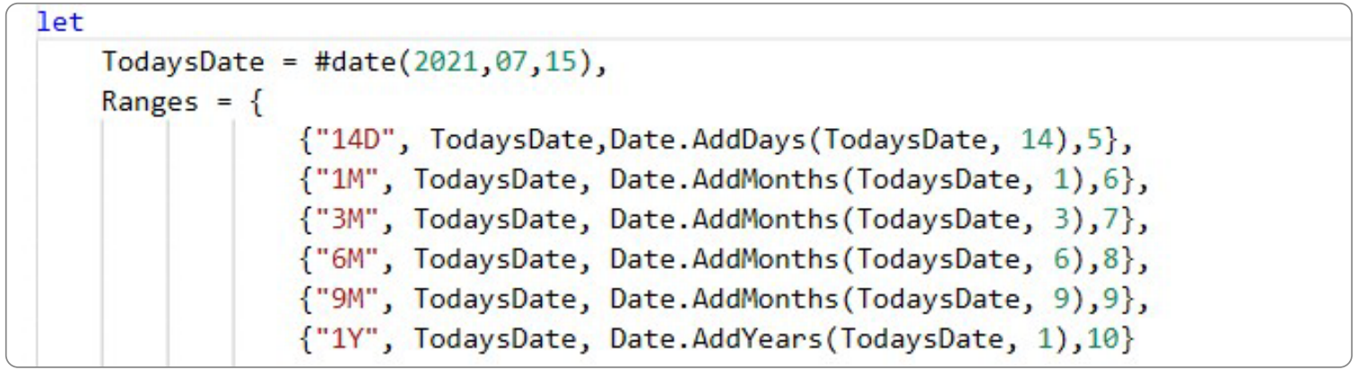
First, create a table in Power Query with a column for the preferred time ranges. In this example, we named our table ‘Period’ and the column ‘Ranges’.
Next, fill in the desired time ranges in the Ranges column. The start date in the example is July 15th, 2021.
Then, create a relationship in the data model between the default ‘Calendar’ date dimension table and the created ‘Period’ table.
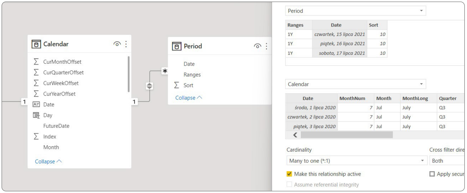
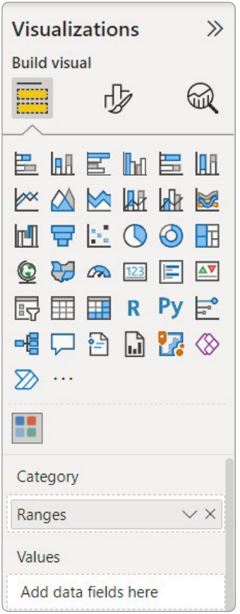
Now, select the type of slicer from the available visualizations and drag the ‘Ranges’ column to the visualization.
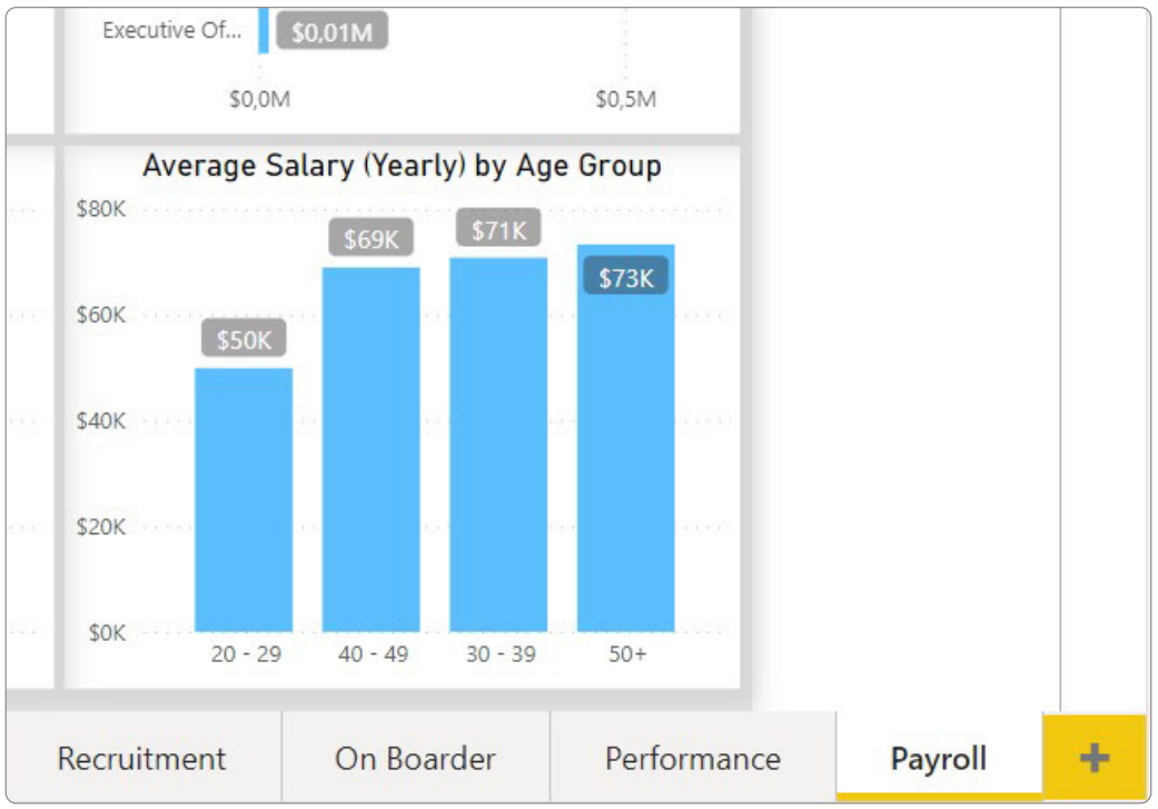
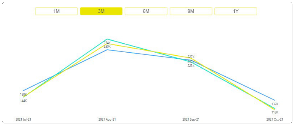
As a result, we create a filter that allows selecting desired time ranges. In the example below, a 3M period slicer has been used in a Sales prediction report.
MANUAL INPUT
Do you need to create a field in your report where a user can input their own values manually? Or do you face issues with the input fields you’ve already created? Fear not, because we’ve got you covered with some handy tips and tricks. This feature – Manual Input – will get you covered.
Why would you need a field like this?
Sometimes you might need to calculate a target based on a value manually filled in by a user. Or perhaps a user needs to provide information about the number of available products, customers, or employees, and this number should be used to calculate the difference between the full database and the actual data.
How to create a manual input field?
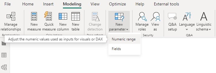
The easiest and quickest way is to use a parameter. Go to the Modeling tab, look for New Parameter, and select Numeric Range.
From there, you can define the value range, increment, and add a ready-to-use slicer to your report.
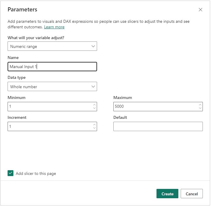
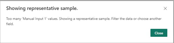
However, this solution can sometimes cause errors. If you need a range from 1 to, say, 5000 or more, you might get an error message stating there are too many values to display.
To fix this, let’s analyze how the parameter is created and how to create one manually.
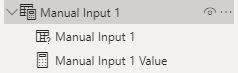
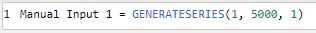
After creating a New Parameter, a new table is added to your data model. It contains a column created by the GENERATESERIES function, which works as the slicer values.
You’ll also get a measure that gives you the value selected in the slicer, which can be used in any calculation in your report.

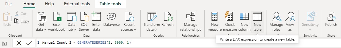
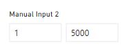
To create a parameter from scratch, add a new table from the Home tab, choose GENERATESERIES, and input the minimum value (1), maximum value (5000), and increment (1).
Create a new measure, but instead of using the SELECTEDVALUE function, use the MAX or MIN function, depending on your needs.

If you already have a parameter created, you can just use it and change the DAX formula in the measure.
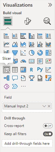
Change your slicer type by adding a new slicer to the page where you need it, and add your manual input column (the column created using the GENERATESERIES formula) as the slicer field.
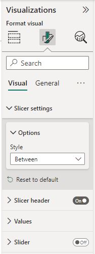
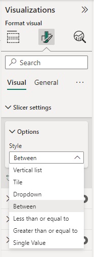
Go to the Slicer settings, choose Between in the Options, and turn off the Slider option.
You should get a slicer that looks something like this:
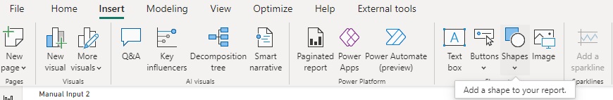
Lastly, hide one of the fields by adding a new shape from the Insert tab with a background color that matches your slicer.
Change the order in the Selection tab so the hidden visual is behind the shape you are using to hide part of the slicer.
If you chose the MIN formula, hide the maximum slicer value. If you chose the MAX formula, hide the minimum slicer value.
And voilà, you’re all set! Now you can add your Manual Input measure wherever you need it in your calculations, and encourage users to use this slicer.
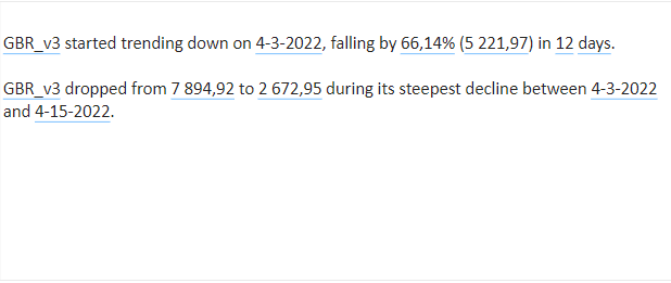
SMART NARRATIVE VISUALIZATIONS
Smart Narrative creates natural language explanations of data, helping you better understand and explain it to others. It adds dynamic narratives to your reports that update with each refresh, making it easier for your audience to interpret data and draw conclusions.
Step-by-Step Data Storytelling:
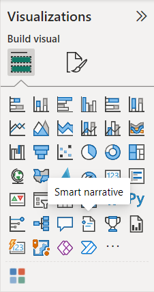
1. Select your report canvas, then head to the Visualizations pane.
2. Click on the Smart Narrative icon to summarize all visuals on the page.
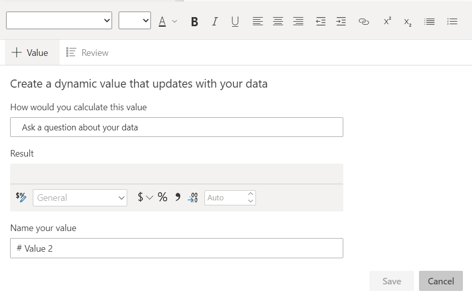
3. Customize your narrative by adding extra info like measures or text fragments.
Smart Narrative’s summary stays dynamic, updating with live values during filtering, ensuring your audience gets the freshest insights.
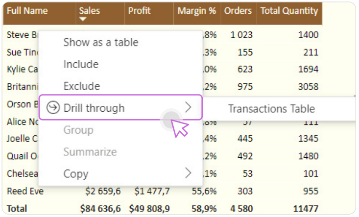
DRILL THROUGH
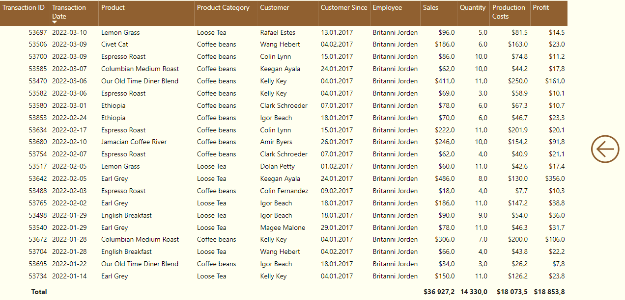
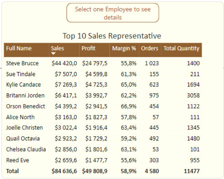
Imagine creating a report summarizing the top sales representatives in your company. You display data about each employee, but all the essential information doesn’t fit within your visualization. This is where Drill Through comes to your aid. It allows you to navigate to an additional tab with relevant details.
How to create drill-through in your report?
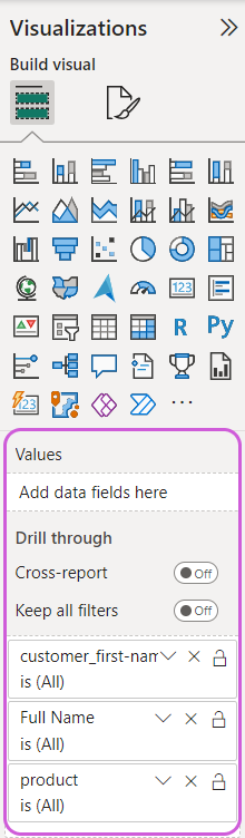
Create a report page to which users will be directed when clicking a visualization on another report page. Let’s name this page “Transaction table.”
This page can be like any other page in a Power BI report, with the distinction that when a user is redirected here, visualizations are filtered based on the element chosen on the previous page when invoking the Drill Through function.
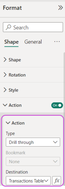
Configure Drill Through logic: set this page as a potential destination for drill-through by navigating to the Visualization panel and configuring the Drill Through settings.
Important note:
Drill Through is configured on the target page, not the page where the user triggers the Drill Through function. Unselect everything, and navigate to the Visualization panel on the right side of the report, where you can see the Drill Through section.
Then go to the visualization tab, to the very bottom of the page. You’ll find a Drill Through editing mode there.
Once Drill Through is properly configured, we can access it in two ways.
The first is to add a button that will allow us to move freely to the detail tab after first selecting a specific person in the visualization.
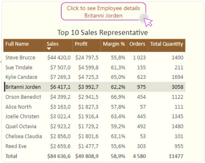
The second way is to click the right mouse button and select Drill Through. If you have configured everything correctly, Power BI will suggest the specific tab where you have added the Drill Through option.
By following these steps, you can enhance your Power BI reports with advanced features, making data analysis more intuitive and effective. Have fun!